
BRAND IDENTITY · HEALTHCARE · CONTENT
Opal Wellness
A health consultancy you reach by phone, branded to feel as solid as a clinic.
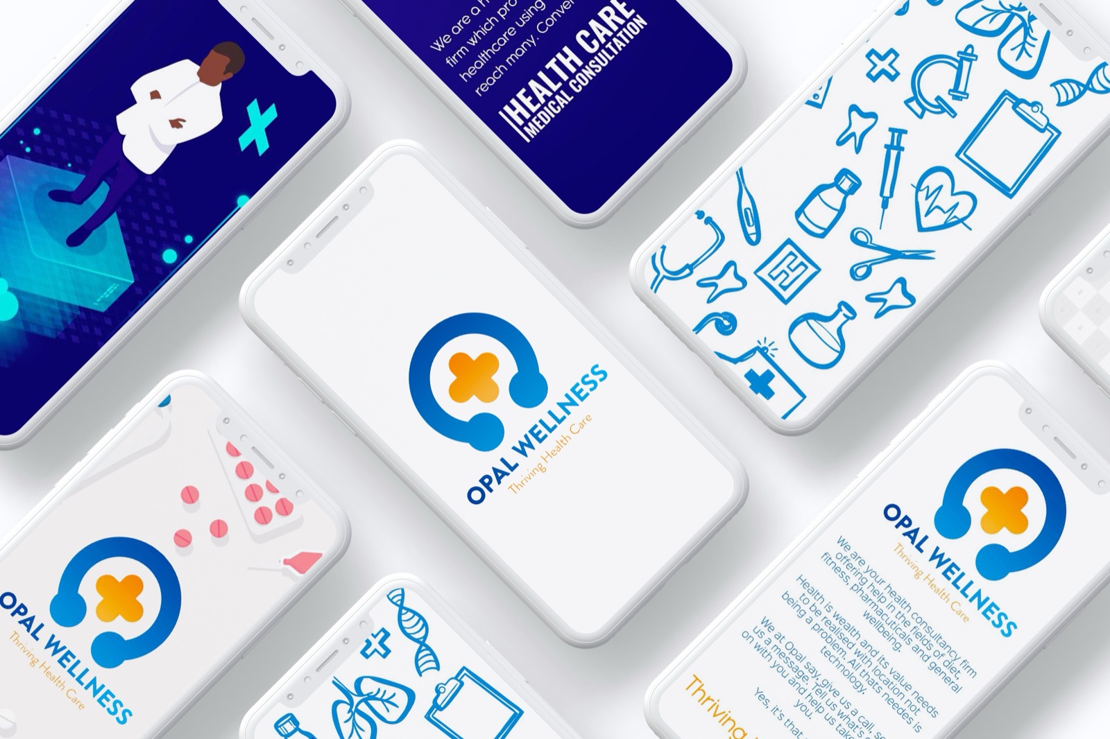
Care is only useful if people can reach it
Opal Wellness set out to make health advice reachable: diet, fitness, pharmaceuticals and general wellbeing, delivered down a phone line instead of across a waiting room. The service worked. The trouble with healthcare at a distance is that trust doesn’t travel as easily as a phone call does.
Medical and human, in one mark
We built the identity around a single idea: a headset wrapping a medical cross. Care, delivered down a line. Blue for the clinical side, orange for the human one, and a photography direction full of families, food and movement rather than hospital corridors. Thriving Health Care, and it looks like it.


4 weeks
To a complete brand identity
Want results like these? Let’s brainstorm.
Tell us what you’re working on and we’ll come back within 2 business days.
Thanks for reaching out. We’ll come back within 2 business days.
Something went wrong sending your message. Please email us directly at mike@brainstormafrica.com and we’ll come back within 2 business days.